Googlebot’s Gem: Mobile-friendly URL Checker
The trend towards possessing a website which is cross-device-friendly (in other words it’s been optimised for optimum viewing across mobile phones, tablets and computers) has gained enormous momentum and for good reason. Numerous statistics and research show that users browsing the internet, and certainly including in Australia, are increasingly using mobile devices, and not just when they are ‘on-the-go’. How many times have you been sitting on the couch at home and, used your mobile phone to browse the internet rather than turn on your laptop?! We’ve all been seduced by the ease of using our mobile devices to search the internet, and Australian SMEs who have jumped on the band wagon are being swept off their feet.
So in the wake of the mobile friendly online revolution, Google have created an URL checker. The site, which is very unassuming in appearance despite the magical tool that it is, simply shows a blank URL tab in which any URL can be added. Google then begins its magic and starts to analyse if the URL which has been entered is mobile-friendly or not.
This is the image of the site:
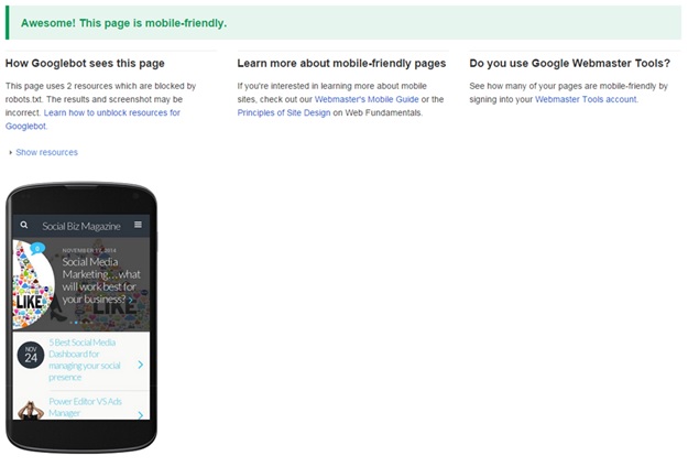
While you wait for the analysis to complete, a green bar will quickly count the percentage of the analysis performed on the site. If the URL which has been entered is mobile-friendly, you will then see this:
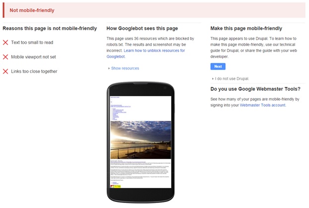
If however the URL which has been entered is not mobile-friendly, you will see this:
The great thing about the last image is that it shows us what it was about the entered URL which made it non mobile-friendly. We can see for this URL the text was too small to read, a mobile viewpoint has not been set and, the links on the page are too close together (a pesky scenario for fingers on a small touch screen). The image of the mobile screen shot (in the eyes of Googlebot) gives us a great perspective for what it may be like for mobile phone users wanting to browse the site; not that appealing, is it? Lastly Googlebot, in this case, has been able to detect how this URL was likely created and then gives instructions and directions as to how this site can be turned into a mobile-friendly one.
It’s all important information as Google has begun to label URLs, mobile-friendly and not, in Google Search Results. If a consumer is browsing the internet on their mobile phone and comes across your site, but it has been labelled as non-mobile-friendly, it’s potentially enough to send that customer elsewhere (your competitors!).
Your call to action could not be more obvious; ensure your website is mobile friendly as soon as possible to equal greater reach across the web and, the sooner the better. Get in touch with the SponsoredLinX Digital Strategy team to discuss your options on 1300 859 600, or visit our website.


