The Key Elements of the Perfect Landing Page!
Despite what you may think, when it comes to your business a stunning website design and intuitive functionality just aren’t enough on their own. However, with the successful amalgamation of science and art, the anatomy of the perfect landing page can bring together a highly relevant stepping stone in your customer’s journey – from the research phase through to the purchase.
So what are some of the key elements you should incorporate into your landing page? Below, we’ve compiled the key elements you need for the perfect landing page!
USE KILLER HEADLINES CONSISTENT WITH YOUR KEYWORDS
Number one is to make sure your headlines match your keywords – this is just good SEO practice. In addition to this, your sub-headings should also take the heading a step further by incorporating power words that make people want to click!
DON’T GIVE USERS A REASON TO LEAVE
You want to draw your viewer in, get their attention, and then convert them to a sale – so make sure your landing page is persuasive, accurate in its pitch, and that it provides exactly what it says it will.
GRAMMATICALLY, ENSURE YOUR COPY IS PERFECT
Believe it or not, people will judge you on typos – no matter how small they may be. Use programs such as Grammarly to make sure your copy is on point! It’s also a good idea to get someone else to read over your copy before you post it.
CALLS-TO-ACTION (CTA)
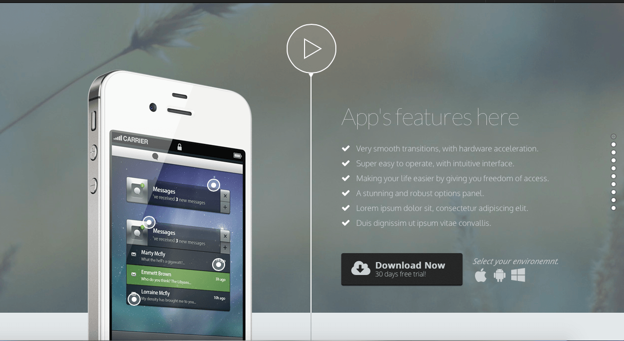
Incentivise your CTA to make it more appealing. For example, instead of writing ‘Register for your free trial,’ try something more reassuring and persuasive such as, ‘Register for your risk-free, no-cost trial today!’ It’s also important to ensure your CTA box is clearly identifiable, and that it stands out.
KEEP KEY INFORMATION ABOVE THE FOLD
When a user comes to your page, it’s possible they are viewing it on mobile, tablet or PC. Make sure you get their attention straight away by positioning the most relevant and useful information at the top of your page.
USE IMAGES AND VIDEO CONTENT WHICH RELATE TO THE COPY AND INTENT OF THE PAGE
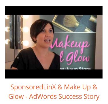
If you’re selling a product, be sure to include a large, high-quality image. Show your users how great your product is! Likewise, if you’re selling a service, try including a video testimonial. This will work in your favour by creating a feeling of trust and reassurance with your potential customers.
USE TRUST INDICATORS WHERE POSSIBLE
Building trust is a key element of your conversion success. Some examples of trust indicators are:
1. To mention lifetime guarantees and extended warranties.
2. To incorporate testimonials wherever possible.
3. To use secure electronic payment portals.
DIRECTIONAL CUES
Unlike a reading a book, you need to provide clues as to how users should view/read your page. Directional cues help to influence the user as to where they should focus, and can include things such as arrows and linear cues, use of white space, and eye-direction strategies.
COLOURS, CONTRAST & FORMATTING
Did you know that colours can elicit different moods? It’s true. Once you’ve identified the feelings you want to elicit – depending on your brand or product – try implementing some different colours, and then monitoring the results. As well as this, you can also use different colours and contrast, along with italics or bold headlines, to help draw attention to your copy and CTA buttons.
BRANDING
When a user clicks through to your page, make sure your brand is instantly recognisable! It’s important for your users to feel assured that they’ve been directed to the right landing page, and you can achieve this through the use of branded imagery, relatable copy, and a clear connection between your ads and the users’ keyword search.
TESTING
A landing page should never be a static element of your online marketing. Even if your landing page is converting well, things can always be better. Implementing A/B or split testing, along with copy and image changes, can all help.
Although these 11 tips are a great place to start, this really is only the tip of the iceberg. To really get ahead in your marketing be sure to register for our ‘Anatomy of the Perfect Landing Page’ Optimise Webinar, presented by our very own CEO Ben Bradshaw! It’s completely free, and you’ll learn everything you need to know about:
– The science behind optimised conversion landing pages
– The link between your marketing campaigns and landing pages
– Using analytics and testing to measure your campaign success
– A case study of optimised conversion landing pages

Register via our SponsoredLinX Events page, and join us on Wednesday 26th October (10:30 am AEST) to learn more!


