The Art & Science Behind the Perfect Landing Page
Why do we do what we do online? What makes us click on something, press the back button, continue to scroll or swipe right? Our online search behaviour is shaped by more than what we are searching for. The way in which information and content is displayed to us also shapes why we do, and don’t, click on any element online. Even the environment in which we are engaging with content online can shape our actions. So as a business owner, having a high converting and optimised landing page is crucial for all of the directed traffic you are directing to these pages. Enabling and utilising the science behind our online behaviours to develop the perfect landing page is where you need to start.
Our online behaviour, and the decisions that we make online are shaped by attributes that many of us are not even aware of. For any savvy business owner who has an online tracking system in place, the data which can be collected around users online can inform them of things which to the naked eye might seem completely unrelated. Computer scientists have discerned that people who have ‘liked’ curly fries on Facebook is highly indicative of people with high intelligence; who would have thought?! So when we think about the key features which can be optimised within a landing page which can actually influence a user’s actions, then the possibilities for increasing conversions becomes clearer as we begin to recognise the scope of things that we can do and what data can tell us. While we cannot make people carry out an action, we can certainly motivate them.
Firstly, you cannot mistake a functional and attractive website with optimised designed landing pages. While your website is your online bricks-and-mortar shopfront, your landing pages are your online sales assistants. They welcome traffic directed towards them to provide them with all of the useful and relevant information customers need in order to make a decision about purchasing your product and/or service.
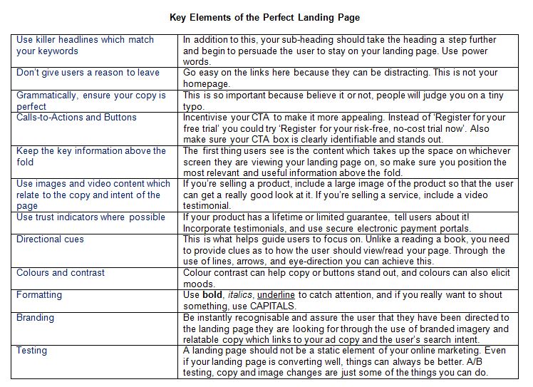
The anatomy of the perfect landing page combines a level of science and art for it to be perfectly optimised. From the placement of copy, calls-to-action (CTA), colours, and imagery to a user’s search intent, landing pages are beacons for high purchase intent customers, and will be successful, so long as they follow certain key features of a well-designed page.
Why would someone find themselves looking at one of your landing pages? Think about your answer. Once you have this answer, ask yourself if the content on that page is answering the question of why someone would find themselves looking at one of your landing pages? If I am one of your customer’s and I’m looking at a landing page on my mobile device which is cluttered with too much copy (either because there is simply too much copy or the page has not been optimised for mobile viewing), doesn’t match the branding of the business I am engaging with, doesn’t link back to the Google AdWords ad I previously clicked on, and the colour scheme appears dark and uninspiring, do you think I am going to hang around to see what you have to offer? Nope, I’m out of there and pressing back to click on one of your competitors.
So what are the key features of a well-designed landing page optimised for high conversion? While it is important to realise that there is no exact formula as each and every business is unique, what we have collated here for you can be tailored to fit any business model.

Stunning website design and intuitive functionality isn’t enough, and now you can understand why. With the successful amalgamation of science and art, the anatomy of the perfect landing page can bring together a highly relevant stepping stone in your customer’s journey from research to the purchase. However, we really have just covered the tip of the iceberg, so why don’t you register for our ‘The Anatomy of the Perfect Landing Page’ Optimise Webinar? Join us on Wednesday 18th November at 10:30 am AEST by simply registering here. Speak to the SponsoredLinX optimise experts today on 1300 859 600.


